Why the Covid ‘Recovery Rate’ is a lousy measure of how we’re doing
It is much more sensible to compare how many people have tested positive this week to last week
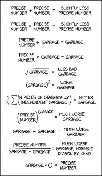
Comic by XKCD. (CC BY-NC 2.5)
Health Minister Zweli Mkhize surely does not relish putting out the daily numbers for Covid infection and death counts. To sweeten the bitter pill, the daily press release traditionally ends by reporting both ‘deaths and recoveries’, and from here flow headlines about the ‘recovery rate’. The steadily creeping-upwards recovery rate, typically the last number in the update, flickers like a glimmer of light at the end of our Covid tunnel.
Unfortunately, this supposed indicator of something useful is just a blurry smoosh of much simpler numbers which have a fairly clear meaning by themselves.
First, let’s understand the very important ‘case fatality rate’ – the proportion of Covid cases which end in death. That is a tricky thing to estimate, and we all hope it’s really low – which it appears to be. We don’t diagnose most of the people with a mild course of disease, but deaths are easier to detect, so we are likely to know of a greater fraction (albeit not all) of the Covid deaths than of all Covid cases. Therefore, a naïve look at official data would tend to overestimate the fatality rate – possibly by quite a bit.
There are a number of ways of being a bit more sophisticated. These attempts have led to estimates of a case fatality rate of about 1 to 2% in South Africa. This is controversial, much higher than we would like, nothing like Ebola, and much lower than many other well-known illnesses.
If we estimate that about 2% of South African’s with Covid can expect to die of it, what exactly does it mean to say that the recovery rate is in the region of 80%, as is currently claimed. What about the other 18% of cases? Apparently they are still ill. They may recover, they may not, time will tell.
Talking in round numbers, since the death rate is not huge, it seems that pointing to an 80% recovery rate is a complicated way of saying that about 20% of cases are ‘still active’. The ‘long haulers’, people who experience significant symptoms for many weeks, or even months, are mainly counted as recovered upon discharge from hospital.
But what this means is unclear. When interpreting numbers, it’s important to attach real world meaning to them. It is pointless to talk about a fever temperature, or a blood pressure, if we don’t know what range is normal, and which ranges of values are slightly, or highly, alarming.
So how do we interpret the older observations that the recovery rate was about 50%, and that now it is closer to 80%; and what kind of recovery rate should we feel good about? Actually all we see in these numbers is that the epidemic is aging. As time passes, an increasing fraction of all cases ever recorded becomes ‘resolved’ – mainly through recovery, and in a few percent of cases, by death. Only in a new epidemic do we have a substantial proportion of all cases being ‘still open’.
The details of how this fraction of ‘still open’ cases gradually winds down over weeks, months, and years are very complicated, and it is very unclear how we should relate to it viscerally – like we can to a case fatality rate. A one in fifty chance of death, given an illness, is easy to compare to a one in five chance of death – and it prompts very different levels of caution to avoid infection.
We might try to use the recovery rate as an indicator of how the rate of infections (technically called incidence) is changing. If the recovery rate goes up high enough (how high, I wonder) then we could feel good that lately there have relatively few cases, compared to all the cases ever detected. This is pretty vague – given the long history of accumulation of ‘all the cases ever detected’. Why not just ask whether the weekly case count is going up or down?
One might then be tempted to point out that there are all these problems with the official case counts, because the levels and consistency of testing vary over time and from place to place. That’s true, but the recovery rate is based precisely on these problematic numbers – just after they have been smeared around a bit — statistically blurred, in fact. Blurring an image doesn’t help us see better – that should be clear.
So yes, naïve consideration of official Covid stats can be misleading. We can look at a variety of more sophisticated estimates, including the best estimates of the case fatality rate, the ‘excess’ deaths (relative to historical trends) being experienced overall, and so on. The Department of Health’s reasons for telling us daily about the recovery rate are probably not cynical, but we should stop reporting on it – for we know not of what they speak.

© 2020 GroundUp. This article is licensed under a Creative Commons Attribution-NoDerivatives 4.0 International License.
You may republish this article, so long as you credit the authors and GroundUp, and do not change the text. Please include a link back to the original article.